Ben Didier
Ben Didier is an independent graphic designer, Noun Project Creator, illustrator and art director based in Vancouver, BC. Since 2006, he has worked with a wide variety of clients of all sizes, specializing in branding, packaging and print projects with a focus on illustration, typography and custom lettering. Past clients include The Royal Canadian Mint, The Washington Post, Old Spice, Oprah Magazine and Softball Canada. As a freelancer, he has collaborated with numerous creative agencies, from Jones Knowles Ritchie and Y&R Prague internationally to renowned Canadian shops like Hulse & Durrell, Pound & Grain, and Rethink. From 2010–14, he worked in-house for the Canadian Broadcasting Corporation, cutting his teeth with daily lettering experiments as the primary designer and art director for CBC Radio 3.
An avid cyclist, rain or shine, he overcompensates for a lifetime of cold Canadian winters by swimming in as many lakes and rivers as humanly possible each summer.
Hi Ben! Tell us about yourself - how did you get to where you are today?
A couple of years at art school, lots of travel, and plenty of trial and error!
When did you first become interested in art and design?
My introduction to graphic design as a discipline happened in high school, and grew out of my love of music. Designing photocopied DIY 'zines with friends was a fun early creative outlet, and functioned as an extension of the music scene. This was in the halcyon days of the internet, and connecting with like-minded people through this community led to my first paid graphic design gigs for small indie record labels. These early projects encouraged me to eventually pursue design as a career.
“The key to any creative collaboration is good communication. It's also important to keep moving forward and not become too attached to any given concept.”— Ben Didier
How would you describe your design style and how has it changed over time?
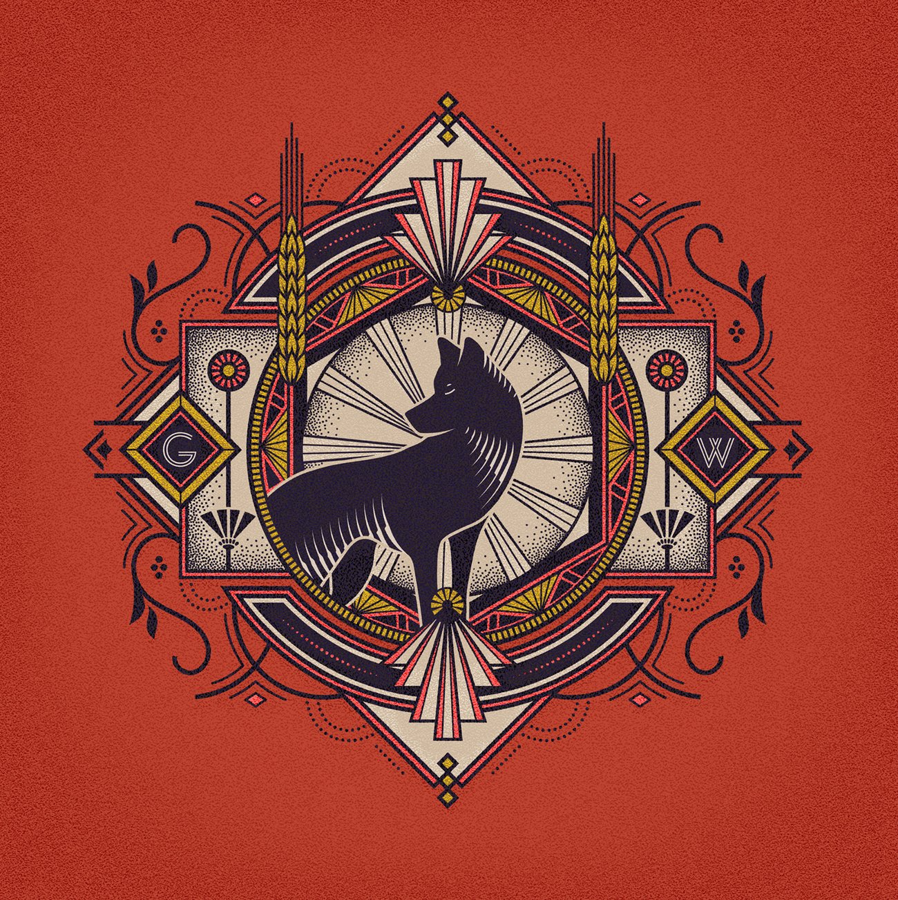
I gravitate towards organic, retro styles, but adaptability is essential. Typography and hand lettering excite me as much as illustration, and working with various techniques helps keep things engaging. I also have a deep-seated love of Art Deco that creeps into my projects from time to time.
How did you discover Noun Project and what led you to start designing icons?
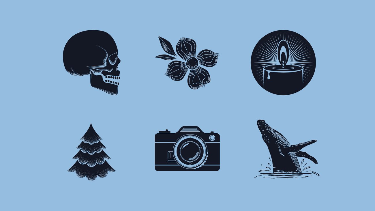
I found Noun Project through the design community in its early days. It was an excellent resource when I was designing in-house and had a lot of graphics to produce on tight timelines. It didn't take long to start sharing my work and contributing to the site. I often upload unused illustrations from client projects, which are adjusted to work better as icons.
What's your creative process like? How do you typically take an idea from concept to delivery?
I usually start with visual research, which doubles as inspiration. Old ephemera collections and physical design books are great resources. In the early going, I do a lot of pencil sketching. This keeps things loose and helps establish the building blocks. My sketches are super rough… I don't spend too much time on careful rendering at this stage. When I move over to the computer, I try to have a clear idea of the path forward. I prefer to work with vectors and rely heavily on an old Wacom tablet and stylus.
How do you approach creative collaboration with your clients?
Every project is really different, so my approach varies. Some clients are very hands-on, while others are more interested in having me art direct. I'm open to any process. The key to any creative collaboration is good communication. It's also important to keep moving forward and not become too attached to any given concept.
What's been one of your favorite projects to work on so far? What would be a dream project?
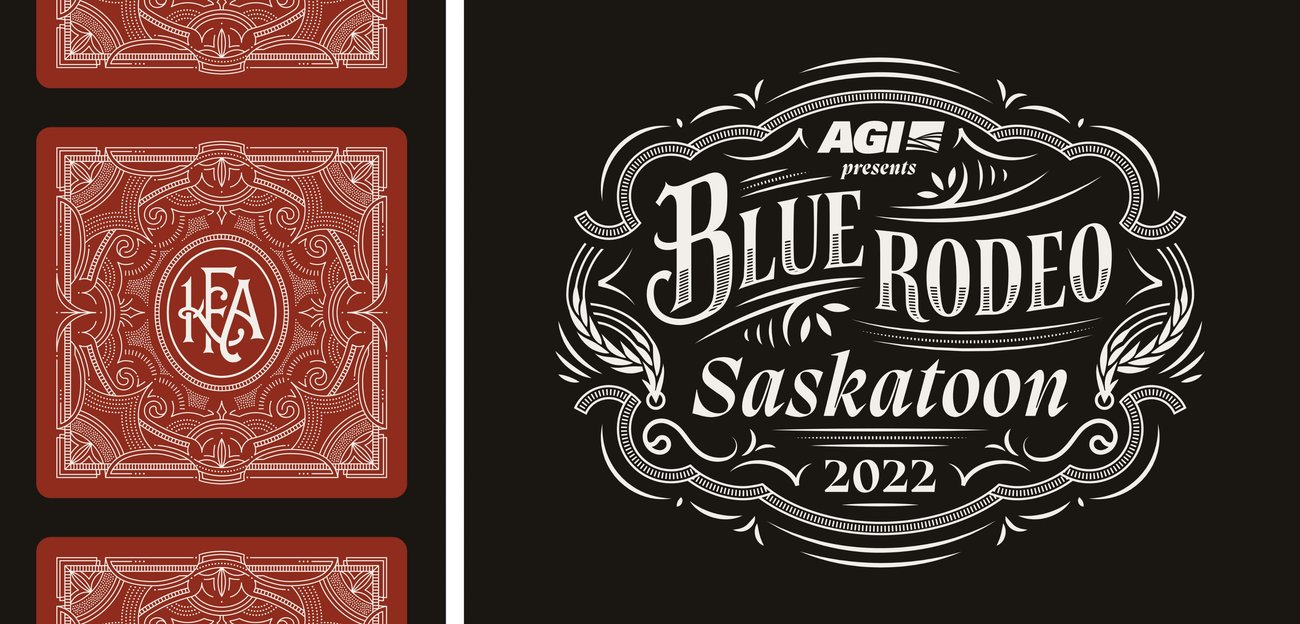
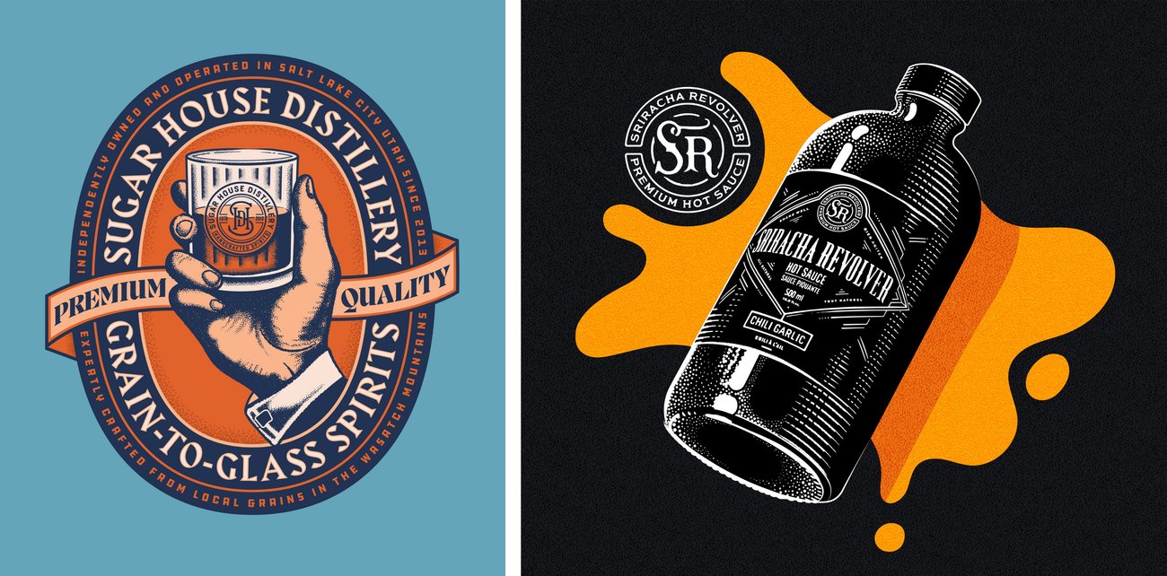
One of my long-term clients, Sriracha Revolver Hot Sauce, has been a really fun journey to be part of. The scope of my involvement has grown with the company over the past decade, including art direction, design, illustration, copywriting, and product photography.
I am most excited about any process that allows me to combine illustration with design. In terms of a dream project, I adore The Criterion Collection and their packaging designs are always next level. It would be a huge honor to tackle one of those at some point.
Do you have any favorite tools or resources? Where do you find creative inspiration?
My trusty Wacom tablet is still a favorite tool that's aging really well. I have a new iPad, and learning Procreate has been a fun challenge. True Grit Texture Supply has been a great resource. I'm also a huge fan of the Pangram Pangram Foundry, which has an incredible library of typefaces and produces an excellent email newsletter.
I'm always on the hunt for inspiration, and most of it comes from just walking around the city. It's a bit counterintuitive, but most design breakthroughs and solutions come when I take a break and get outside.
What advice would you give to new designers and illustrators starting out in their careers?
One of the most important things these days is to keep social media at arm's length. The algorithms don't care about good work, and all the main platforms are designed to turn you into a full-time content generator for them. Trust in your work regardless of engagement, and try not to chase all the hollow metrics.
What are you working on now and what's up next for you?
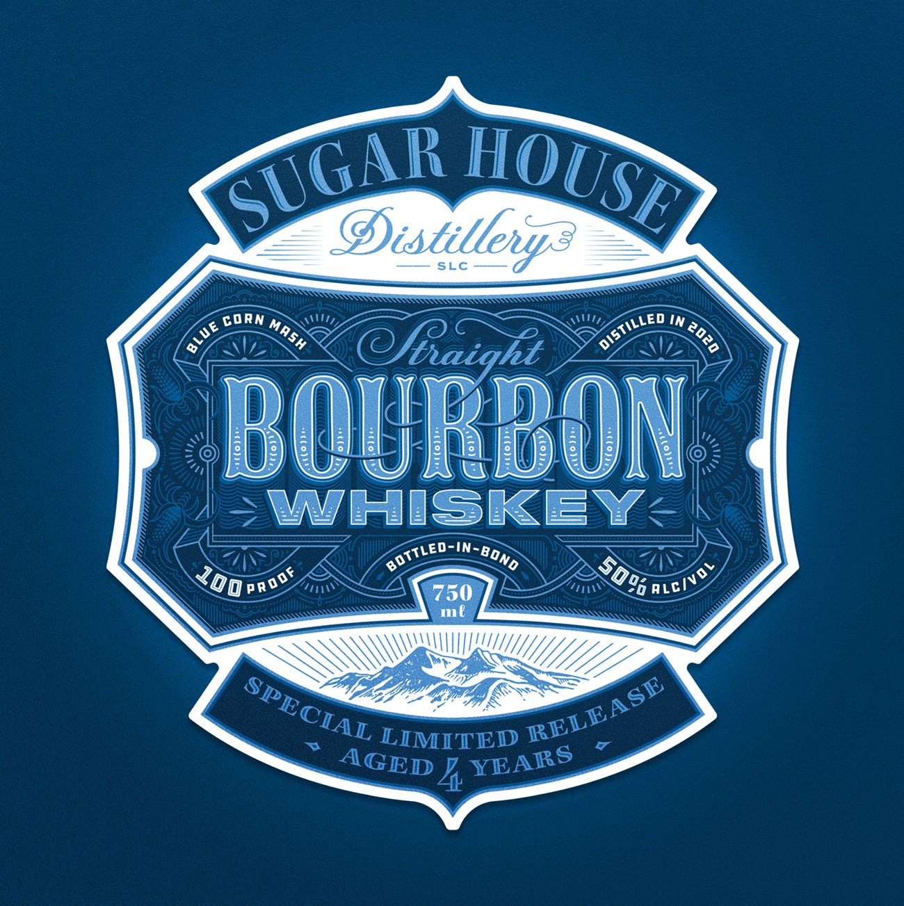
I am currently working on a branding project for a Boston bakery and some new designs for Sugar House, a distillery I've been fortunate to work with for several years. Up next, I'm looking forward to some lakeside camping trips this summer!
To view more of Ben's work, visit his website, Dribbble, Behance or Instagram.
Ben was nominated by Noun Project. All artwork courtesy of Ben Didier.